Greyscale
Neutral tokens from white through black, used for backgrounds, dividers, and text hierarchy.

Product Design Intern · Design System · 2025
Over the summer of 2025, I interned at Mavericks in Motion, a South Korea–based wellness startup. As the sole designer on an early-stage team, I led product design for DailyMove — a community-driven routine app — while building the foundations of a design system the engineering team could implement consistently.
This project was selected for the 2025 Pre-Startup Package and secured KRW 30 million in funding.
What is DailyMove?
DailyMove helps users build routines through community and personalized recommendations. During pre-launch, the product needed a shared visual foundation before the team could move quickly across onboarding, feed, and community surfaces.
Problem
As an early-stage startup shipping toward TestFlight, DailyMove needed more than one-off screens. Without shared tokens and components, every new feature introduced visual drift and extra back-and-forth with developers. I focused on establishing a design system that could support faster iteration across the product.
Design systems
I documented color, type, components, and accessibility standards in Figma so design and engineering shared one source of truth — covering the patterns we reused most across onboarding, community, and routine flows.
Greyscale, blue and red color scales, and a full type ramp from Display through Label — shared tokens across every surface.
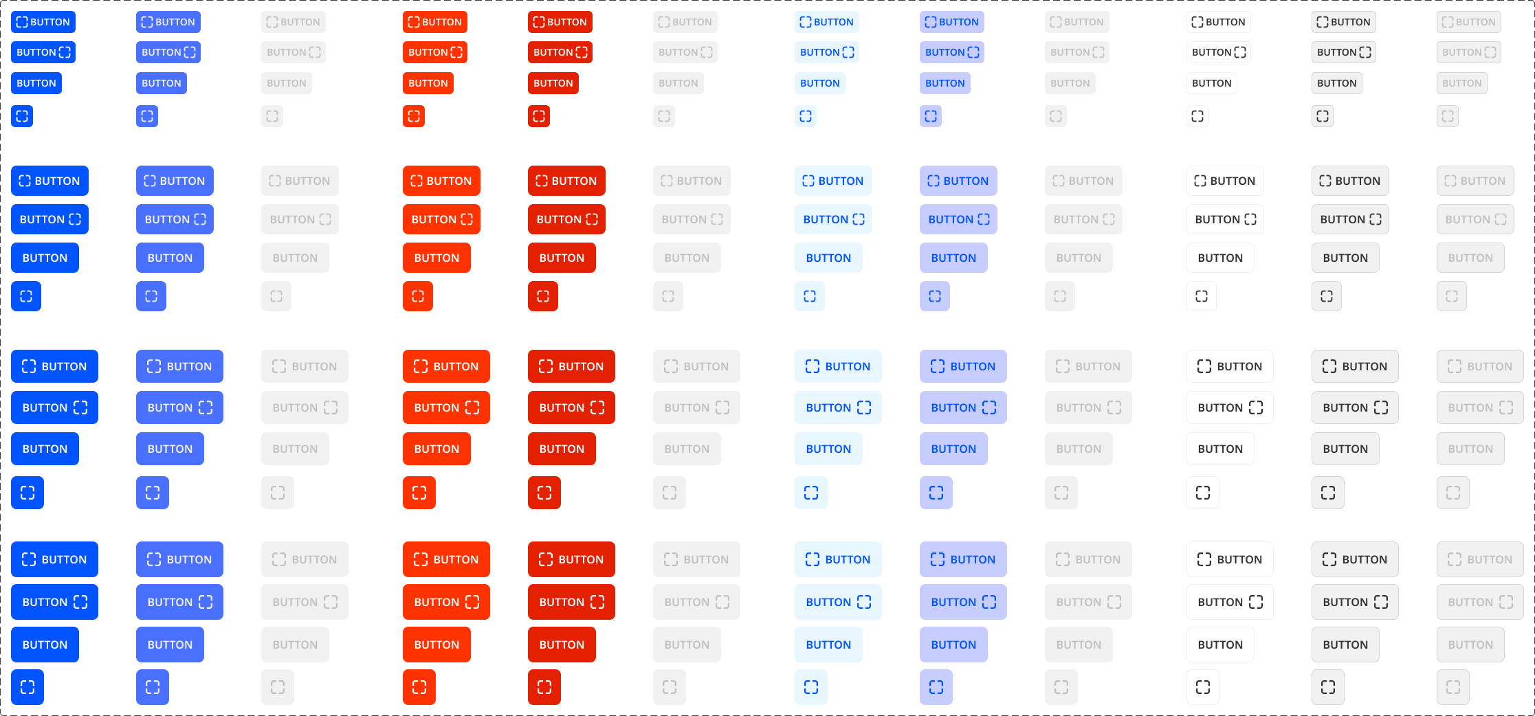
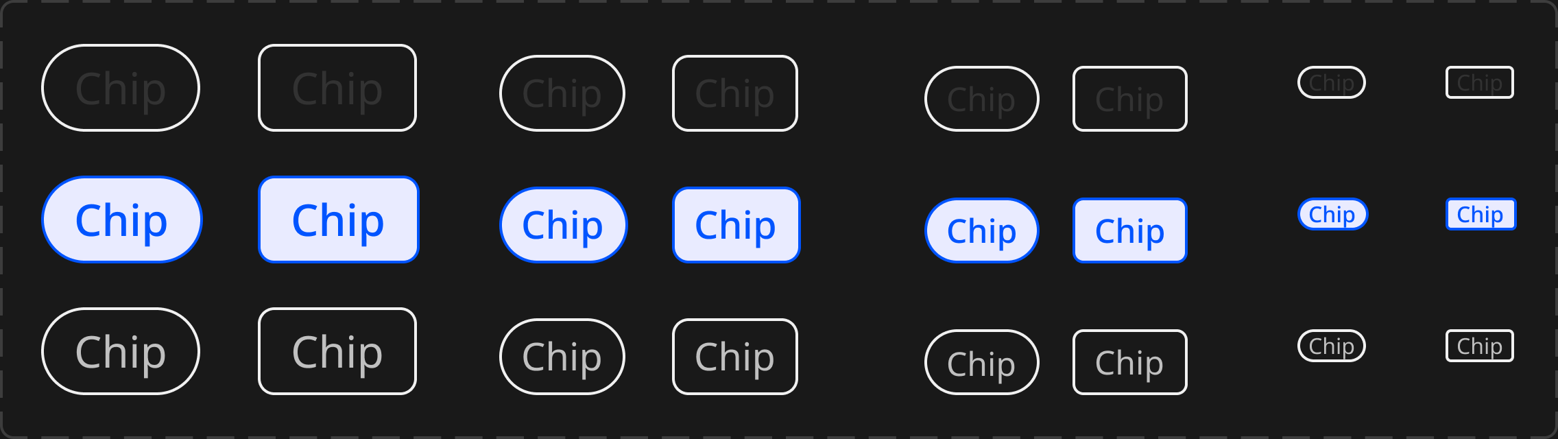
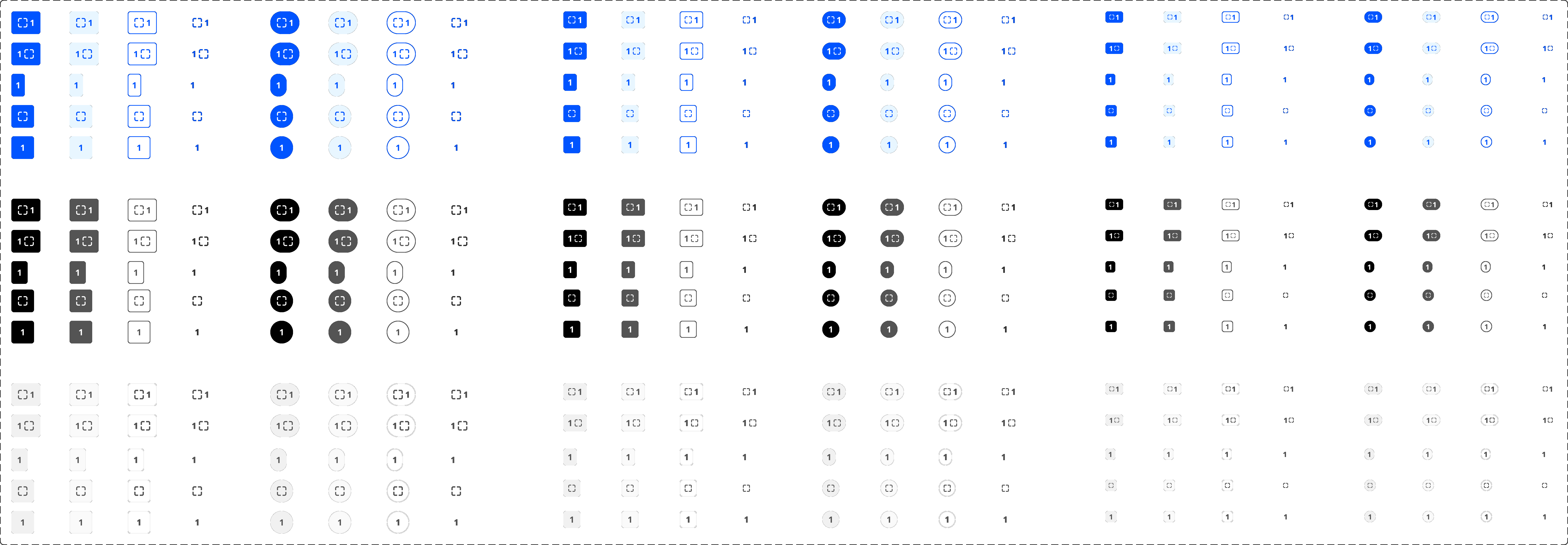
Buttons, chips, and badges documented with size, state, and color variants so engineering could implement without guesswork.
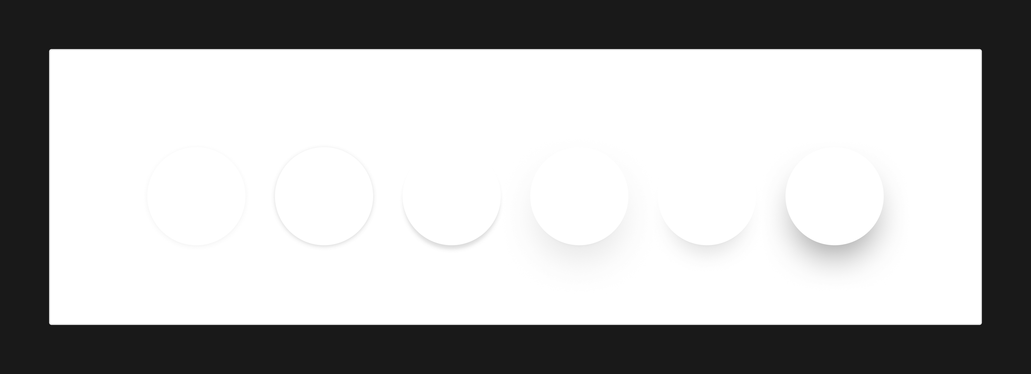
Shadow elevation scale plus minimum 40px touch targets and 4.5:1 contrast applied to interactive patterns.
Foundations
Neutral tokens from white through black, used for backgrounds, dividers, and text hierarchy.
Blue and red scales at 10-step increments (0–90), with base values marked for primary UI usage.

Manrope across five categories — Display, Heading, Paragraph, Label, and Single Line — each with fixed size, weight, and line-height tokens for mobile-first routine and community UI.
Display
96 · 52 · 44 · 36
Bold
1.2
Heading
40 · 36 · 32 · 28 · 24 · 20
Bold
1.2
Paragraph
18 · 14 · 12
Regular
1.4
Label
18 · 16 · 14 · 12
SemiBold
1.4
Single line
16 · 14 · 12
Medium
1
Manrope · Regular, Medium, SemiBold, Bold · Single-line Strong uses Bold at 16 / 14 / 12
Components
Primary, secondary, and ghost buttons across sizes and states — default, hover, pressed, and disabled.
Selectable interest chips for onboarding and filtering, with default and selected treatments.
Status and count badges in multiple colorways for notifications, labels, and inline metadata.
Effects
A stepped shadow system for cards, sheets, and floating actions — keeping depth consistent across routine lists and community surfaces.
Accessibility
Interactive elements met a minimum 40px touch target and 4.5:1 color contrast, aligned with the button and text tokens documented in the system.