
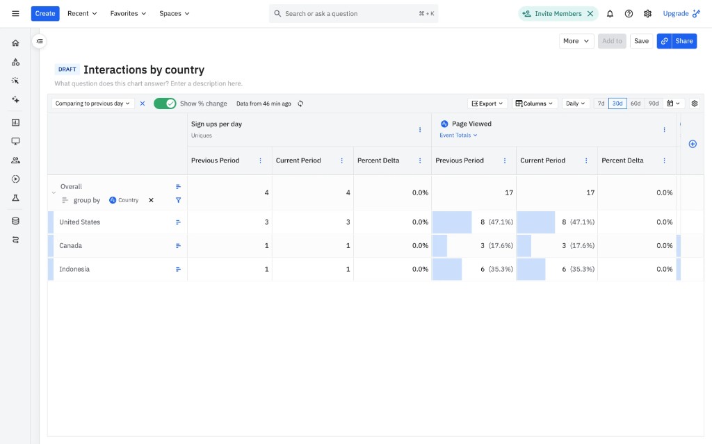
Amplitude left-aligns labels and right-aligns numbers for easy scanning and comparison. Consistent decimal formatting helps users compare values at a glance.
Product Design · 2026
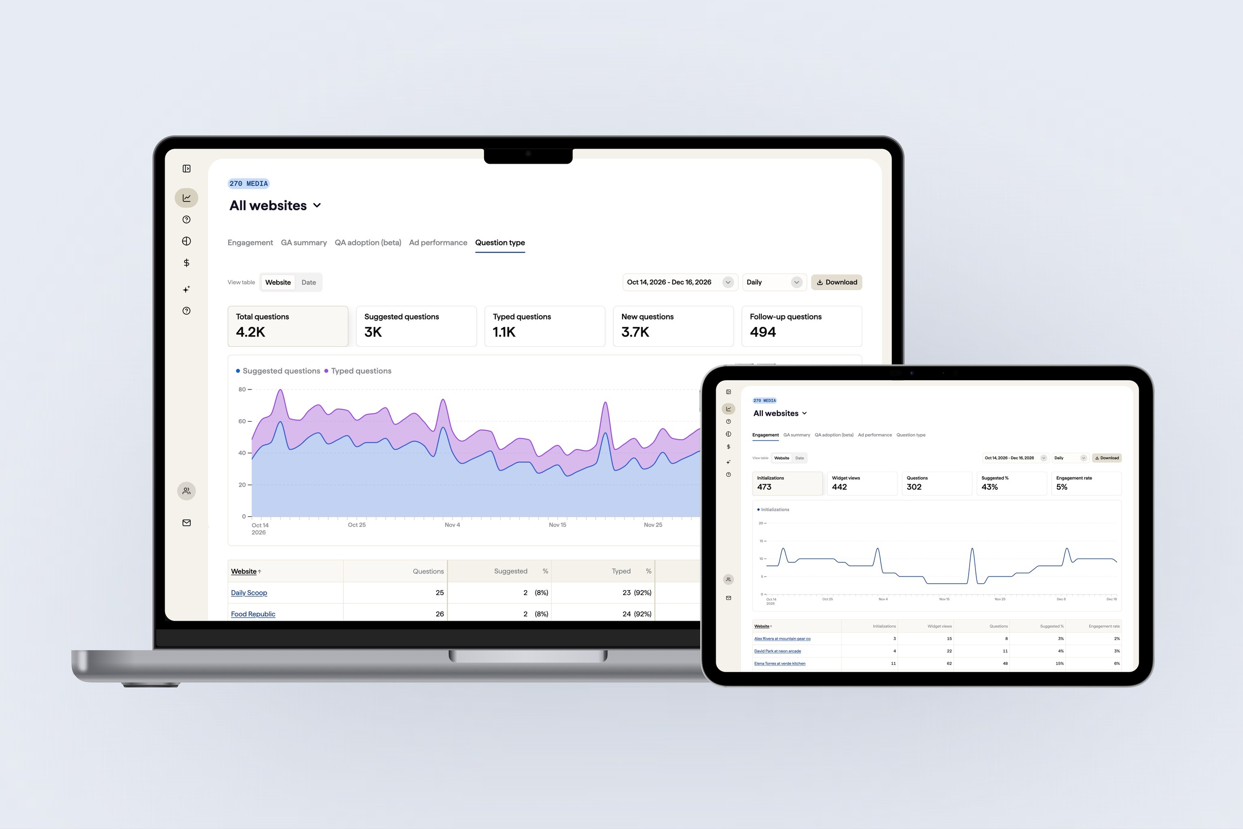
Analytics Dashboard for AI Answer Performance
00 Context
ProRata AI is an AI technology company building products that help publishers and brands participate in the AI ecosystem through attribution, engagement, and monetization.


The company has two product areas: Gist Answers and Gist GEO.
Among those, I worked on Gist Answers, an embeddable AI answer engine that publishers can integrate into their websites. Powered by Gen AI, it provides users with contextual answers while attributing the original content sources. For publishers, Gist Answers creates a deeper content discovery experience while opening new opportunities for engagement and monetization.
As a core part of the Gist Answer platform, the Gist Answer Console helps both publishing partners and internal teams understand how AI-powered answers perform across the network.

For publishing partners, it provides visibility into user engagement, content usage, and performance metrics, helping them understand the value and impact of their content within AI-generated answers. For internal teams, it serves as a centralized tool to monitor partner content performance, identify usage patterns, and uncover opportunities to improve the AI answer experience.
01 UXR & Problem
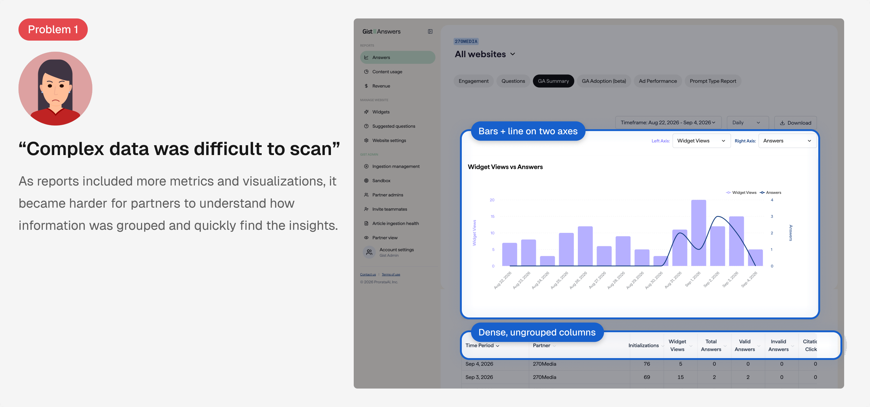
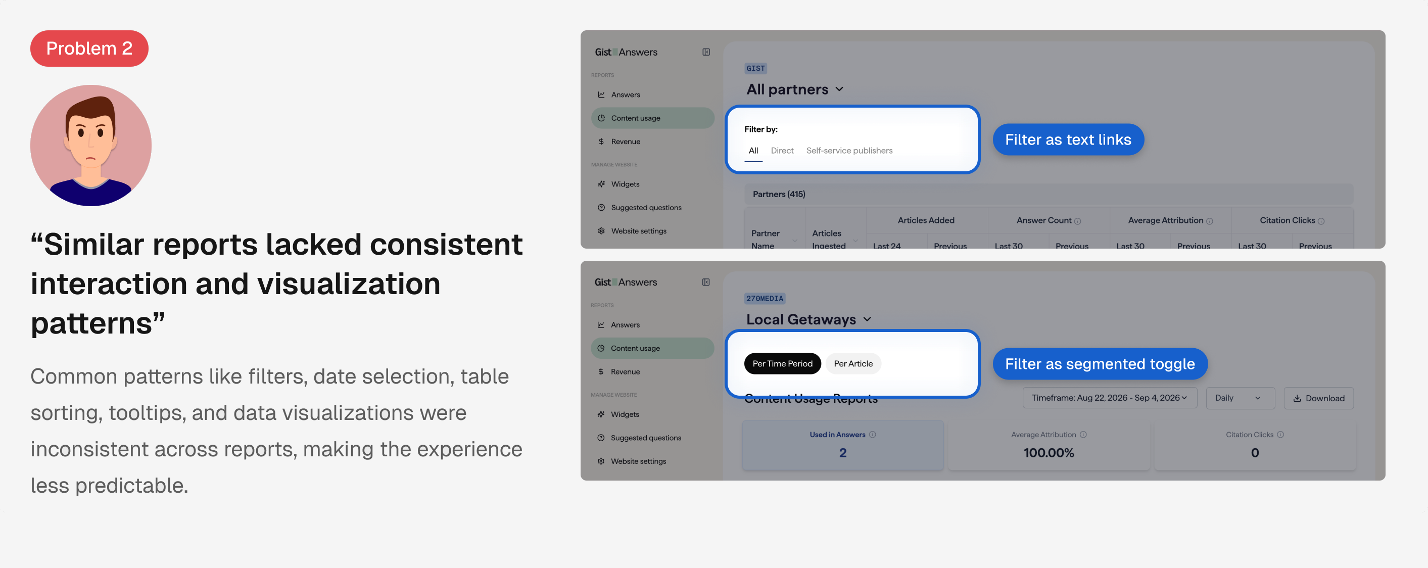
The Gist Answer reporting dashboard contained multiple reports with different types of metrics, controls, charts, and tables. As more reporting capabilities were introduced, users had to navigate dense datasets without a consistent pattern.
To identify usability issues, we interviewed publishing partners, internal teams, and engineers, using mixed user research methods.
Duration
45 minute sessions
Format
Semi-structured virtual moderated
Method
Pre-completion form
Measurement
Post task questionnaire
02 Competitive analysis
To identify opportunities to improve Gist analytics dashboard, I conducted a competitive analysis to understand how other products handle complex data in ways that help users easily understand and compare diverse metrics.
Amplitude left-aligns labels and right-aligns numbers for easy scanning and comparison. Consistent decimal formatting helps users compare values at a glance.

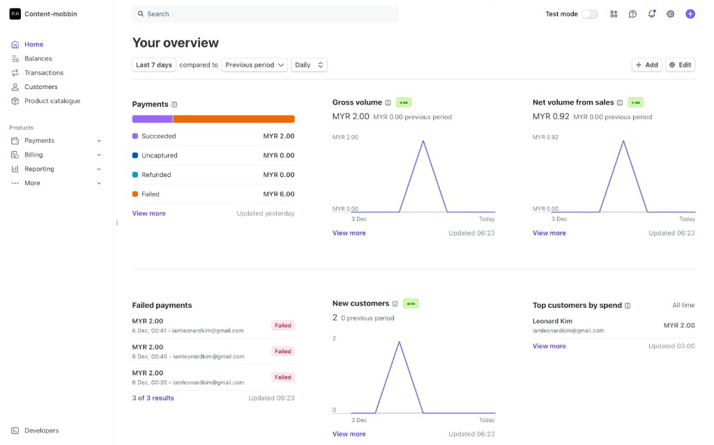
Stripe uses line charts to show financial trends over time and distinct colors to differentiate payment statuses, making complex data easier to interpret.

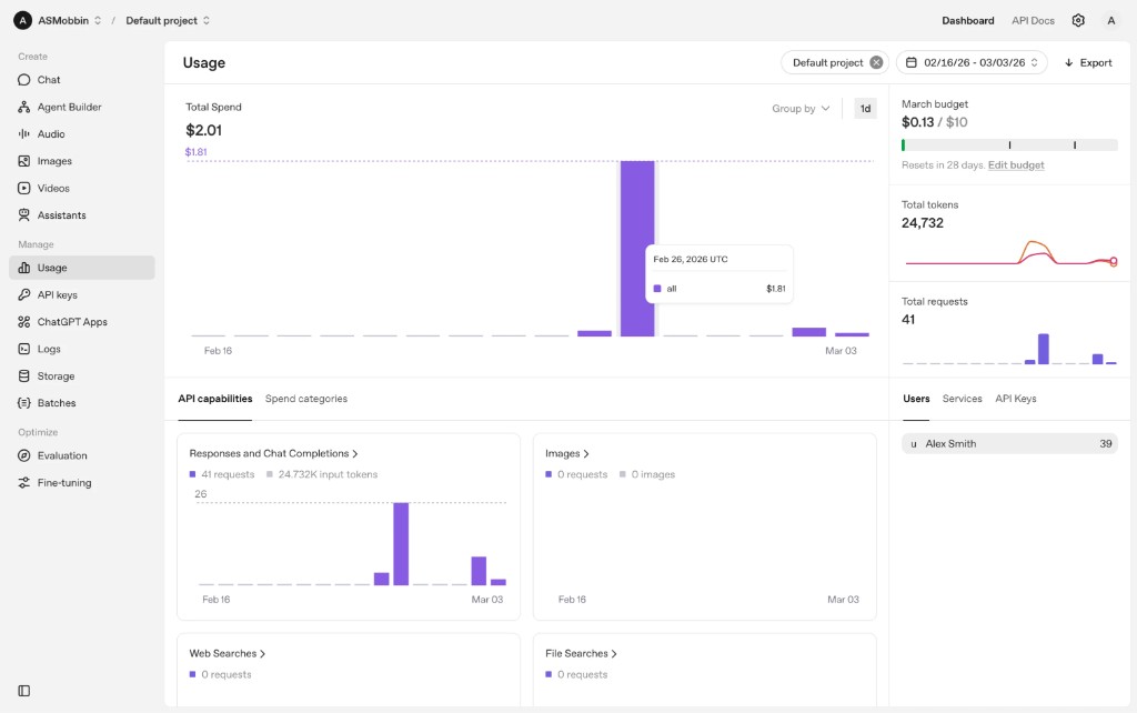
OpenAI uses line and bar charts to display usage metrics, with shared date, filter, and download controls consistently placed at the top for easy access across pages.
Design question
How might we make complex reporting easier to navigate, scan, and compare while establishing a shared visual language across Gist analytics?
Leading analytics products rely on shared visual language—aligned tables, purposeful charts, and global controls. We wanted to bring that consistency to Gist Answers so partners spend less time decoding the dashboard and more time understanding their data.


03 Goal
Based on the findings from user interview and competitive analysis, I focused on consistent navigation, table layouts, and chart conventions to make reports easier to scan and compare.
To address the user pain points, I focused on three key areas.
Reorganize navigation and page controls
Group partner-facing reports into Engagement, Questions, and Content Usage, then standardize shared page controls.
Redesign tables for multi-metric datasets
Define column-level widths, alignment, grouping, and scroll interaction so dense analytics stay readable.
Improve accessibility across reports
Audit color contrast, responsive layouts, and typography hierarchy against WCAG so reports stay readable for everyone.
04 Approach #1 — Navigation Regrouping
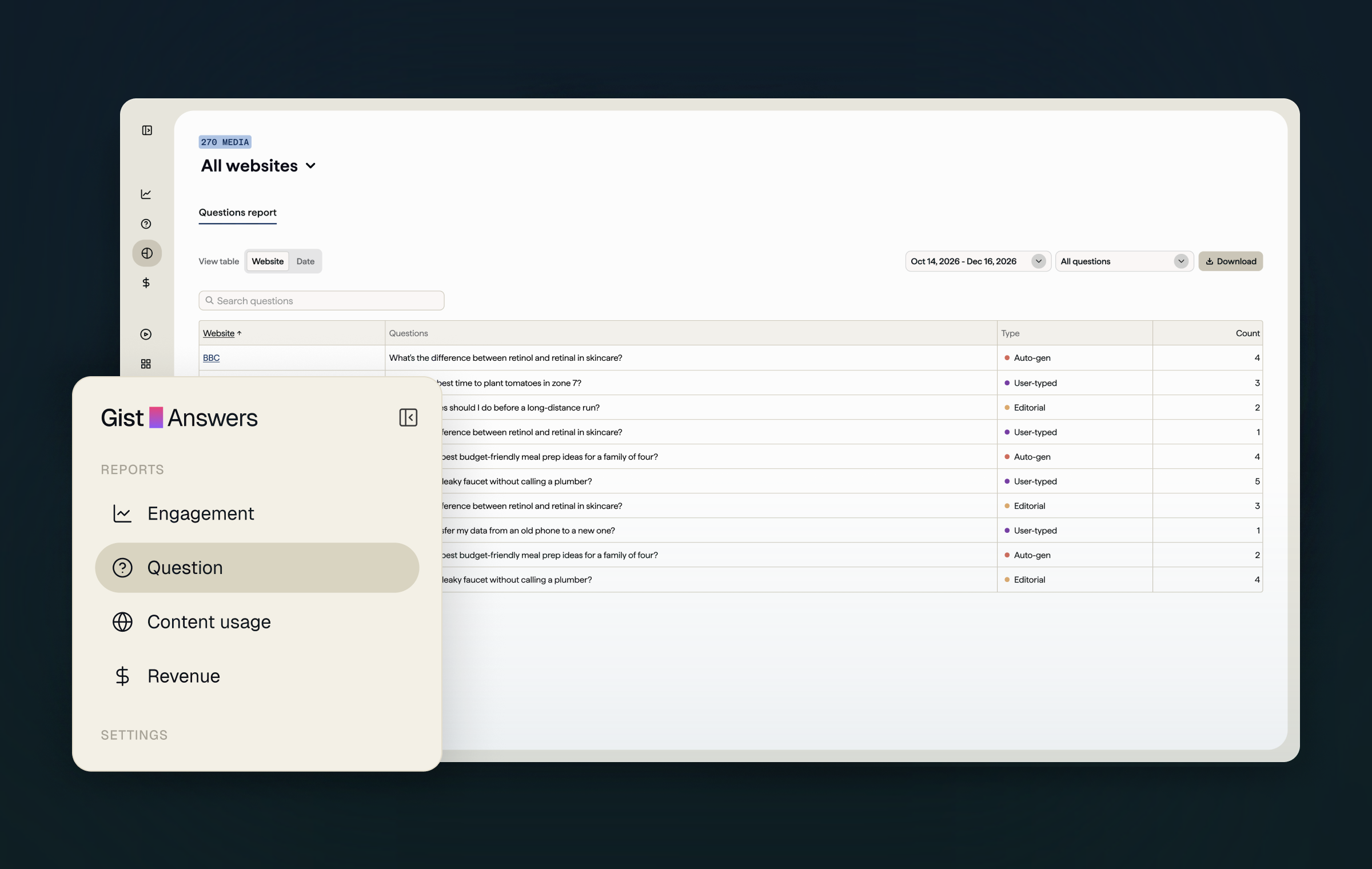
Improvement #1
I separated Engagement and Questions into dedicated navigation sections because they serve distinct analytical goals: understanding how users interact with AI answers versus identifying what users are asking. This structure better aligns with users’ mental models and makes reports easier to discover.
Engagement pages
Question pages
Other reporting
I explored how to organize reports around users’ analytical goals rather than grouping them under the broad “Answers” category.
Reports
Different analytical goals grouped under one broad category.
“Answers” grouped reports with different analytical purposes, making navigation less predictable.
Reports
Clearer subgroups, but still nested under “Answers.”
Separating reports into subcategories clarified their purposes but retained an unnecessary navigation layer.
Reports
Top-level categories aligned with distinct reporting goals.
Promoting Engagement and Questions to top-level categories made the structure more closely reflect what users wanted to analyze.
Engagement
Questions
Other reporting
Reports
Manage website
Questions was grouped with engagement reports, even though it served a different goal.
Reports
Settings
I moved Questions to its own top-level page, so each section now serves one clear reporting goal.
05 Approach #1b — Page controls
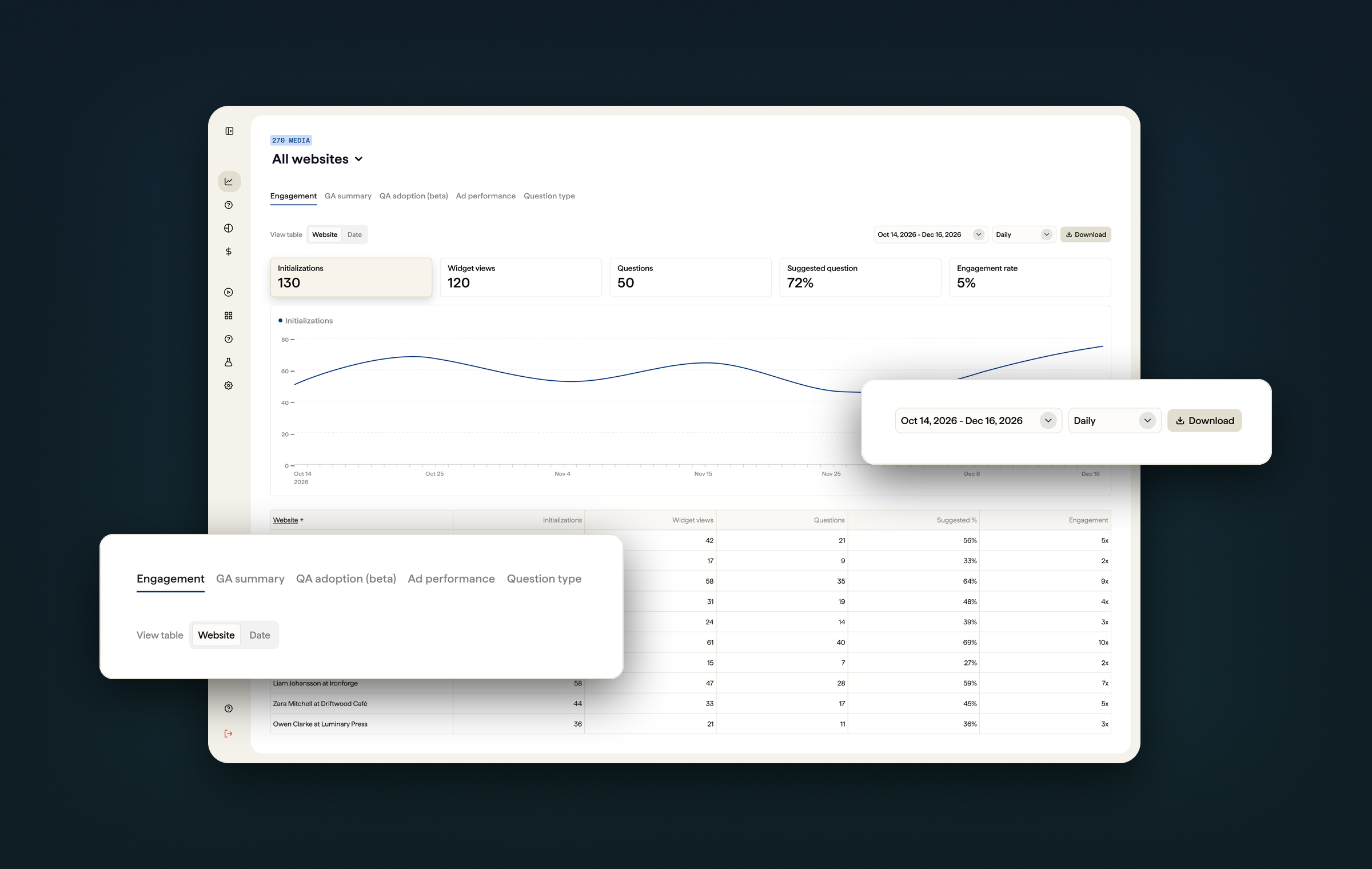
Once the top-level navigation got clearer, each page needed predictable controls. I standardized recurring controls at the top of each page and removed repetitive report titles.
I first unified report tabs into a single tab bar and anchored the date range and Download to the same row on every report. Review rounds showed the page title only repeated the selected tab, so I removed it and merged view, timeframe, granularity, and Download into one control bar.
Fragmented controls across reports
Timeframe, granularity, Download, and chart axis selectors were stacked in separate rows, so each report had its own layout.
Unified navigation, cluttered header
Every report became a tab and the controls moved beside the page title, but the title repeated the selected tab.
Consistent layout, redundant elements
Title, date range, and Download shared one row across reports, and search and filter moved to the table they act on. The title still repeated the tab and Download stayed low-emphasis.
Streamlined unified control bar
Fewer tabs after the navigation split, no repeated title, and view, timeframe, granularity, and a brand-colored Download grouped together.
Chip-style tabs, a repeated report title, and a low-emphasis download button.
Tab navigation, removed repeated title, and a brand-colored download button.
06 Approach #2 — Tables
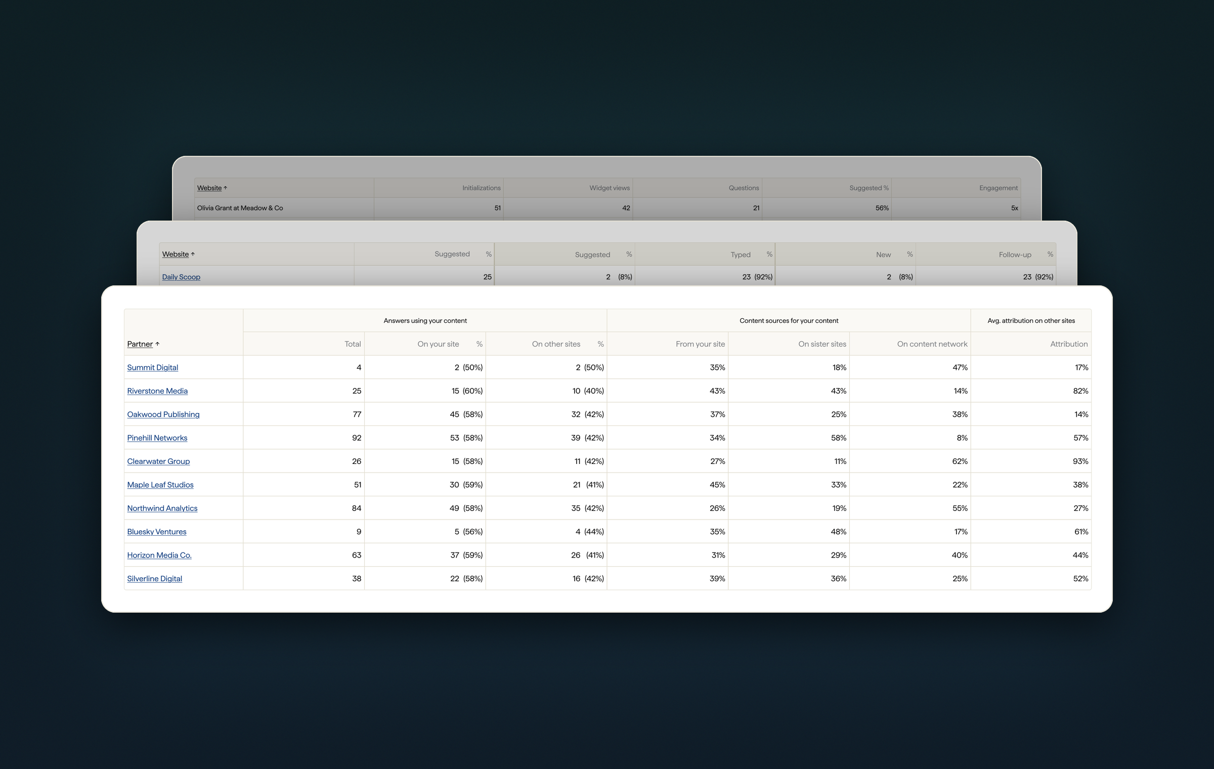
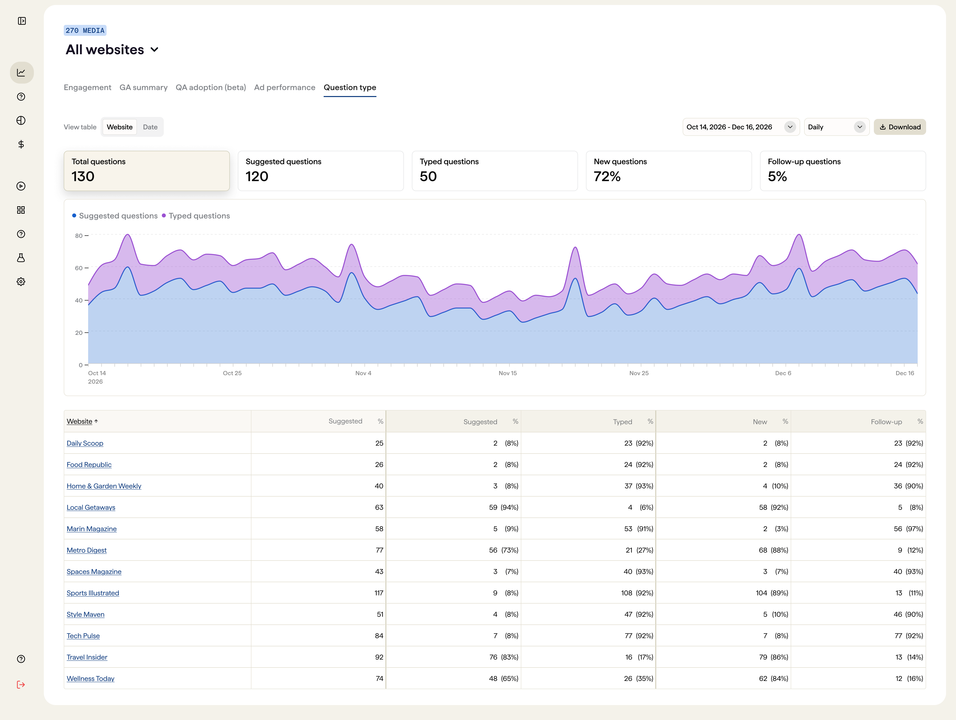
Tables became one of the most important parts of the redesign because tables contained many metrics simultaneously, and users needed to compare those.
Improvement #1
Numeric columns right-align when expanded and left-align at minimum width so dense metric columns stay easier to compare.
The initial table design used left align for some column and center align for other column, causing inconsistency and visual clutter
The updated table uses consistent column alignment: numeric columns right-align when expanded and left-align when the table is at its minimum width.
Improvement #2
I tightened the horizontal padding inside each column so more metrics fit in view at once. The extra room goes to the data itself, reducing horizontal scrolling and truncated values in dense reports.
16px of inner padding on every column left little room for content, crowding headers and values in dense tables.
Reduced inner horizontal padding to 4px to create more room for table headers and content, while keeping control arrow hidden by default to maximize available space and reduce visual clutter.
Improvement #3
I introduced a View by control so users could change how table data was grouped—such as by website, date, or partner—without navigating to another report. This kept the same column rules and scan patterns while letting partners reshape the dataset in place.
Controls stay pinned
As the page scrolls, View table, date range, filters, and Download stick to the top so key actions are always in reach.
Column headers stay visible
The table header sticks under the controls, so long datasets keep their labels while you scan.
Improvement #4
Sort arrows used to sit on every column header at all times. I hid them by default and revealed them on hover or keyboard focus, while the sorted column keeps its arrow to show the current direction. Headers got more room, and the table stayed quieter until users needed to sort.
Every column showed a sort arrow at all times, adding visual noise and taking space away from headers in dense tables.
Arrows appear only on hover or keyboard focus, and the sorted column keeps its arrow to show direction.
08 Accessibility
Partners spend long sessions in dense analytics, so I audited the redesign against WCAG—focusing on the three layers that most affect how data is read: color, responsive layout, and typography.
01 · Color system
Charts carried most of the meaning in each report, so every color had to stay distinguishable—against the canvas and against each other—including for people with low color vision.
Color 3 #F58975 · Color 5 #7EACF1
Indistinguishable
Pair contrast
1.04:1
Color 1 #1760CC · Color 4 #F6C687
Distinguishable
Pair contrast
3.73:1
When scanning a chart, users match lines to the legend by color. Two pairs in our palette had nearly identical luminance, so they read as the same tone in grayscale or with color vision deficiency.
I checked every chart color against WCAG 1.4.11 (3:1 for graphical objects), flagged the look-alike pairs, and made sure meaning never relied on color alone.
Check contrast against the canvas
Each chart color is measured against white; colors below 3:1 are reserved for non-essential fills.
Separate look-alike pairs
Colors with near-identical luminance are never placed next to each other in the same chart.
Never rely on color alone
Legends, direct labels, and tooltips repeat the series name so the chart reads without color.
02 · Responsive design
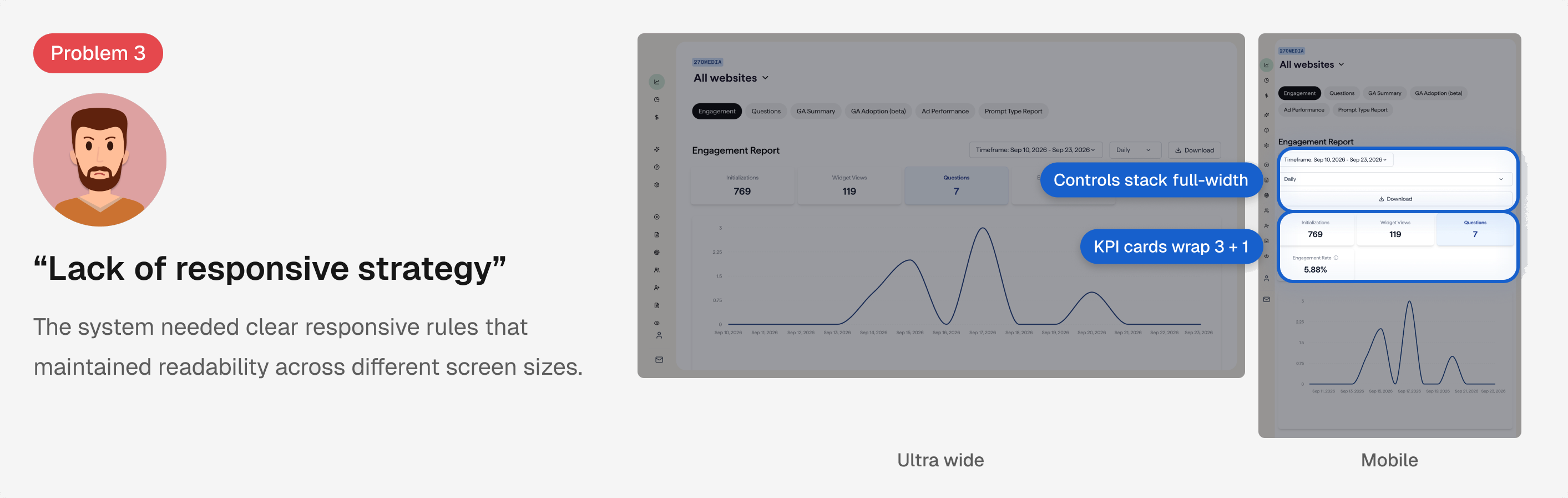
The original tables kept shrinking to fit the viewport, so headers truncated and numbers wrapped mid-value—hardest to read exactly when the screen got smaller.
I set five breakpoints with a 12-column grid and minimum widths, so content reflows (WCAG 1.4.10) and scrolls past its minimum instead of compressing text.
Five breakpoints on one 12-column grid
Ultra wide to Mobile share the same grid; only spans, gutters, and margins change.
Minimum widths over shrinking
Content holds a minimum width and scrolls horizontally instead of compressing text.
Navigation yields space first
At Compact, the side nav collapses to an icon rail so data keeps its room.
03 · Typography hierarchy
Headings were sized by eye, so levels were skipped and some sections looked more important than the page title. Screen readers rely on heading levels to navigate, so visual size and structure had to match.
One H1 per page, no skipped levels
Headings describe structure; smaller text uses Body or Caption, not a lower heading.
Shift the whole ladder for dense screens
Compact H1 takes H2's size, H2 takes H3's—never shrink H1 alone.
A dedicated style for data
Dense/Data (14px, compact leading) keeps table cells and list rows tight but legible.
09 Usability testing
Before handoff, I ran usability tests on the redesigned reports to check whether users could find the right report, change the timeframe and view, and compare metrics without guidance.
Task: Find the website with the most answers last quarter and export the report.
Illustrative recreation of a test task. Quotes and data are representative.
Outcome
10 Design handoff
Clear design documentation was essential for both engineering implementation and partner team alignment. After finalizing the design, I clearly organized the changes I made and handed off.
11 Impact
The redesign established consistent patterns for navigation, tables, and visualization across Engagement, Questions, and Content Usage—so new reports could extend the same system instead of inventing another interaction model.
As an intern, I proposed and handed off this system for build; the patterns were designed so partner-facing analytics stay easier to scan and compare as the product grows.
Unified navigation, table layouts, and visualization patterns across key reporting pages.
Defined responsive behaviors and minimum widths to preserve readability across different screen sizes.
Refined chart color contrast, typography hierarchy, and responsive layouts using WCAG guidelines.
12 Reflection
Working on this project reinforced that being a product designer requires strong communication and collaboration across teams with different priorities and areas of expertise.
Since the dashboard was designed for publishing partners, I worked closely with the partner team to understand their reporting needs and translate design decisions into language that was clear and relevant to their goals. When handing off designs to engineering, I documented design and component specifications in an organized way to reduce ambiguity during implementation.
This experience taught me that being a good product designer on a team is not just about communicating with other designers, but also about bridging the gap between teams and providing the information each stakeholder needs to move the product forward.
This project allowed me to explore accessibility at a deeper level than in my previous design work. I came to understand that the fundamental purpose of designing for accessibility is not simply about meeting design standards, but about creating experiences that people can use regardless of their physical conditions.
Throughout the redesign, I applied accessibility principles by refining chart color contrast to improve data distinguishability and redefining the typography hierarchy to support clearer information structure and screen reader navigation.
This experience helped me recognize that accessibility should not be treated as an additional design consideration, but as a fundamental part of creating inclusive and usable products.
I believe the fundamental purpose of every project is to address user pain points. To create helpful solutions, it's essential to first understand users' pain points and identify the underlying causes.
Working on the complex analytics dashboard taught me the importance of taking a more systematic approach to problem-solving. Through user interviews, I identified usability challenges; through competitive analysis, I explored opportunities for improvement; and through multiple design iterations, I refined solutions based on those insights.
This experience made me realize that a good solution is not just about solving individual usability issues, but about finding the intersecting pain points across multiple users and understanding how different parts of a product work together to create a cohesive and scalable user experience.
Working with Hajeong is incredible! We worked together to plan AI/UX skill lessons for our fellow product team. She beyond hard working, very intelligent, and so kind. Hajeong would be an incredible addition to any team. Her AI/UX knowledge is valuable and needed. I looked forward to every meeting with Hajeong!