Overleaf Redesign: Consolidated Scattered AI Entry Points
Over summer of 2025, I had an opportunity to redesign Overleaf, a technical code editor, as part of Design For Passion 2025.
The redesigned Overleaf redefines the existing AI entry point by consolidating scattered AI buttons, making the AI features more glanceable and accessible by allowing users to discover more easily.
Timeframe
Jul 2025 - Sep 2025
Role
UI/UX Design
Tools
Figma
Team
2 UX Designer
1 UX Researcher
WHAT IS OVERLEAF?
Overleaf is a browser-based LaTeX (code) editor for academic and technical documents.
It’s similar to Google Docs, but instead of directly editing text, users make changes by writing code.

PROBLEM
Scattered AI entry points increased cognitive load and hindered discoverability, while the robot button’s visually cluttered interface failed to clearly distinguish between generative and highlight-level AI, leading to user confusion.

Scattered AI entry points make navigation difficult, revealing the opportunity to consolidate these features into a single space
Poor differentiation between generative and highlight-level AI, making it hard to tell which features are AI
The AI features in the robot button’s submenu are visually cluttered, making it difficult for users to distinguish them from other AI options
FEATURE BACKGROUND
AI features that generate new content, including title, abstract, keyword, and equation generators
AI feature for particular sentence, that users must highlight editor to access. Includes paraphrase, translate, change style, split / join, summarize, explain
Generate Level AI
AI feature can be grouped into two categories
Highlight Level AI
DESIGN QUESTION
How can we provide users with more glanceable and accessible access to AI features?

Define User Needs:
Semi-Structured Interview
Research Insight
Users found AI entry points scattered and visually inconsistent, which made navigation confusing and the robot button’s submenu feel redundant.
Users struggled to understand how to use AI features due to fragmented entry points and unclear mode signaling.
USER INTERVIEW

DESIGN GOAL
Based on insights from user research, our design goal was to provide AI features that offer clear discoverability and mode transitions.
Direction 1 is about introducing a centralized AI panel to consolidate AI actions and switch between Generative and Highlight modes
Direction 2 is about using the Robot button as a unified entry point, allowing users to choose between two different AI modes within a single flow
APPROACH 1 — SWITCH BETWEEN TWO AI MODES
Introduced a centralized AI panel to consolidate AI actions and toggle between Generative and Highlight modes
ITERATIONS — SWITCH BETWEEN TWO AI MODES
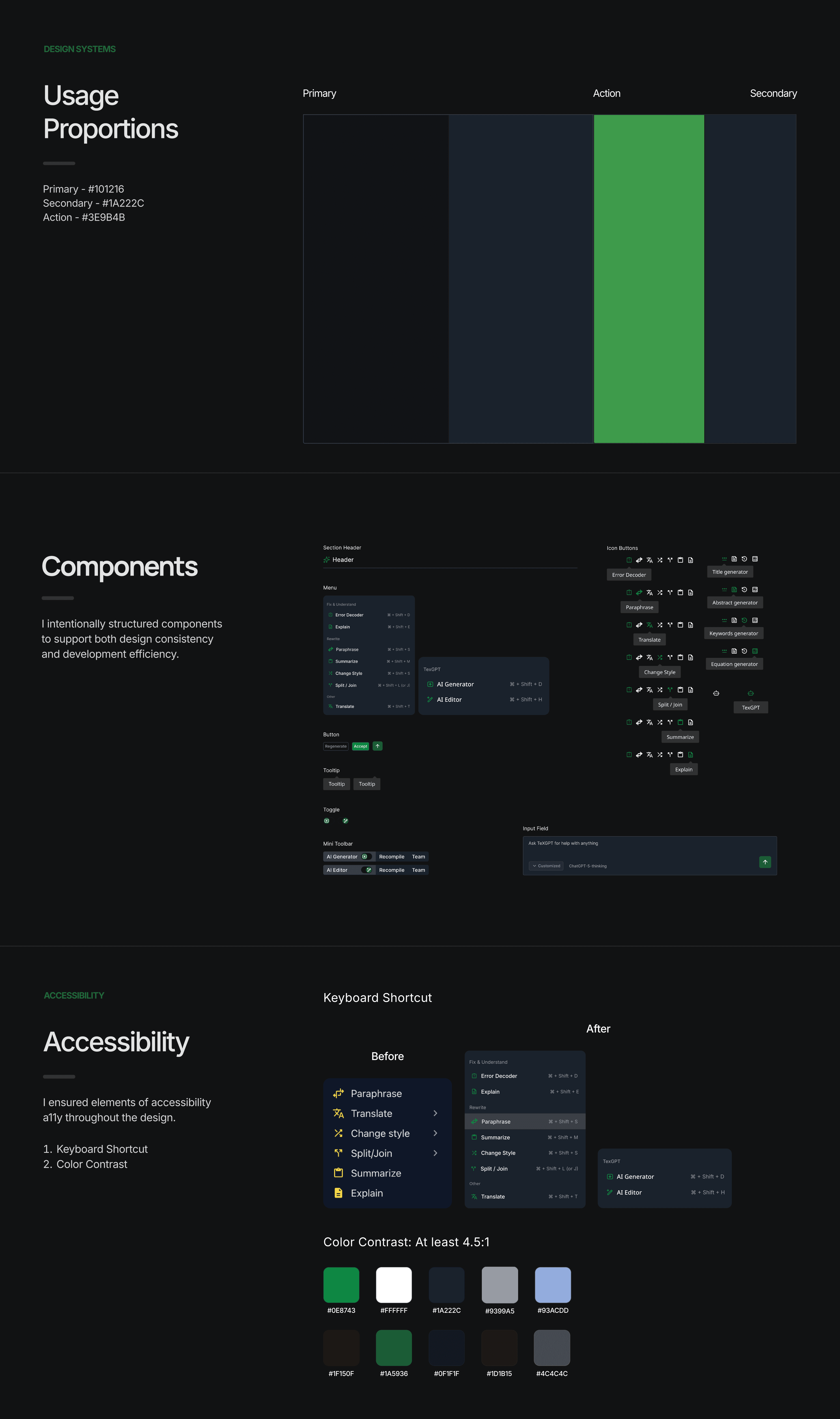
Before finalizing the design, I refined the color usage and components to improve visual consistency and reduce eye strain, making the panel more intuitive to use.
Improved Mode Scanability by Replacing the Switch with a Toggle
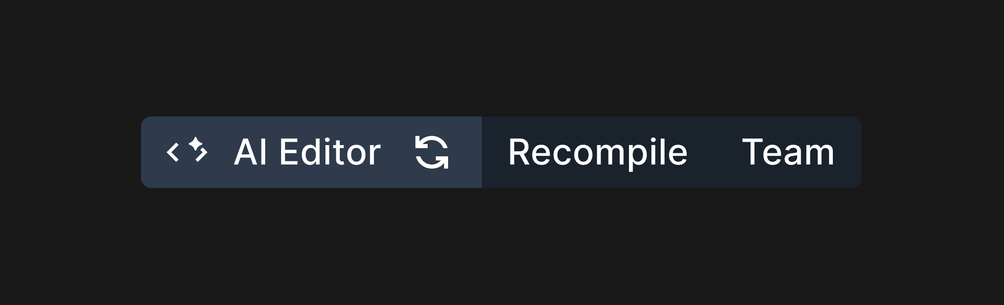
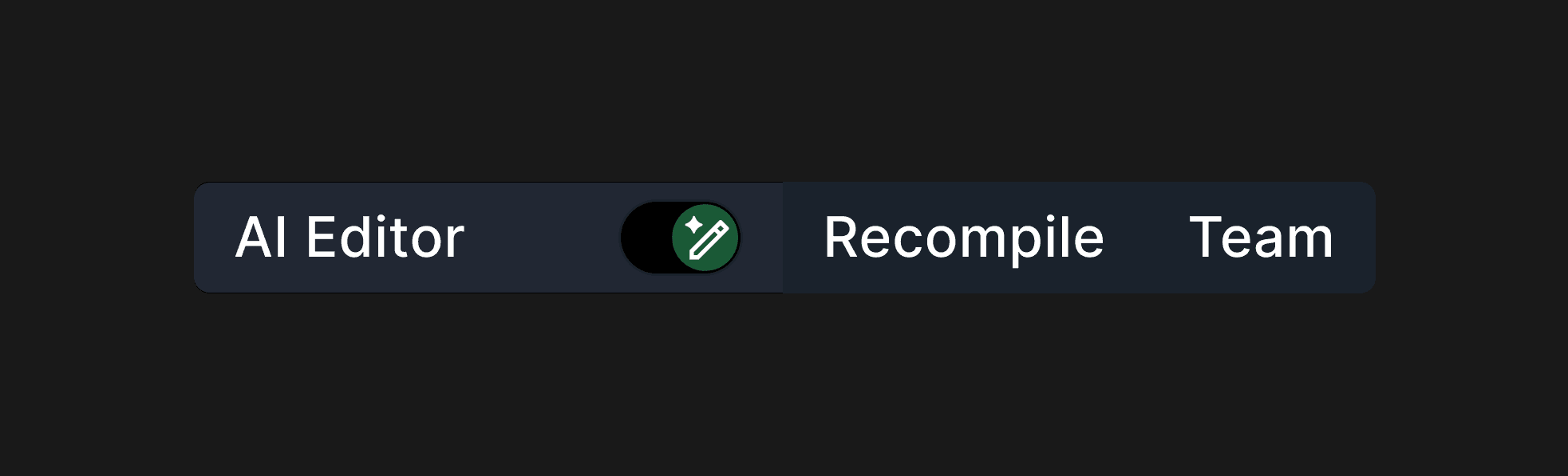
I replaced the switch button with a toggle to give users a more immediate sense of switching between the two AI modes.
Before
After
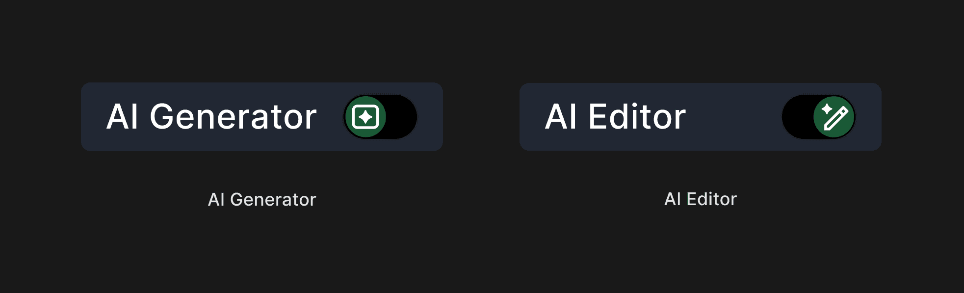
Built a Custom Toggle for Switching Between Generative and Highlight-Level AI
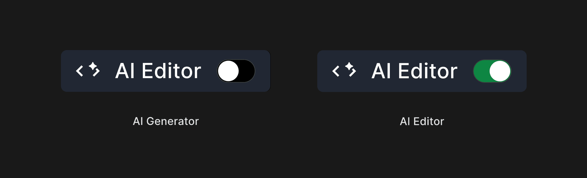
I designed a toggle for generative and highlight-level AI, using mode-specific icons to improve glanceability and quick recognition.
Before
After
Reduced Visual Fatigue Through Color Contrast Refinement
I refined the UI to reduce eye strain for users, as Overleaf is typically used for long, extended work sessions. To improve visual comfort, I reduced the contrast between the background and text by adjusting the background color from #000000 to #101216 and updating the text color to #E3E3E3.
Before

After
FINAL EXPERIENCE — SWITCH BETWEEN TWO AI MODES
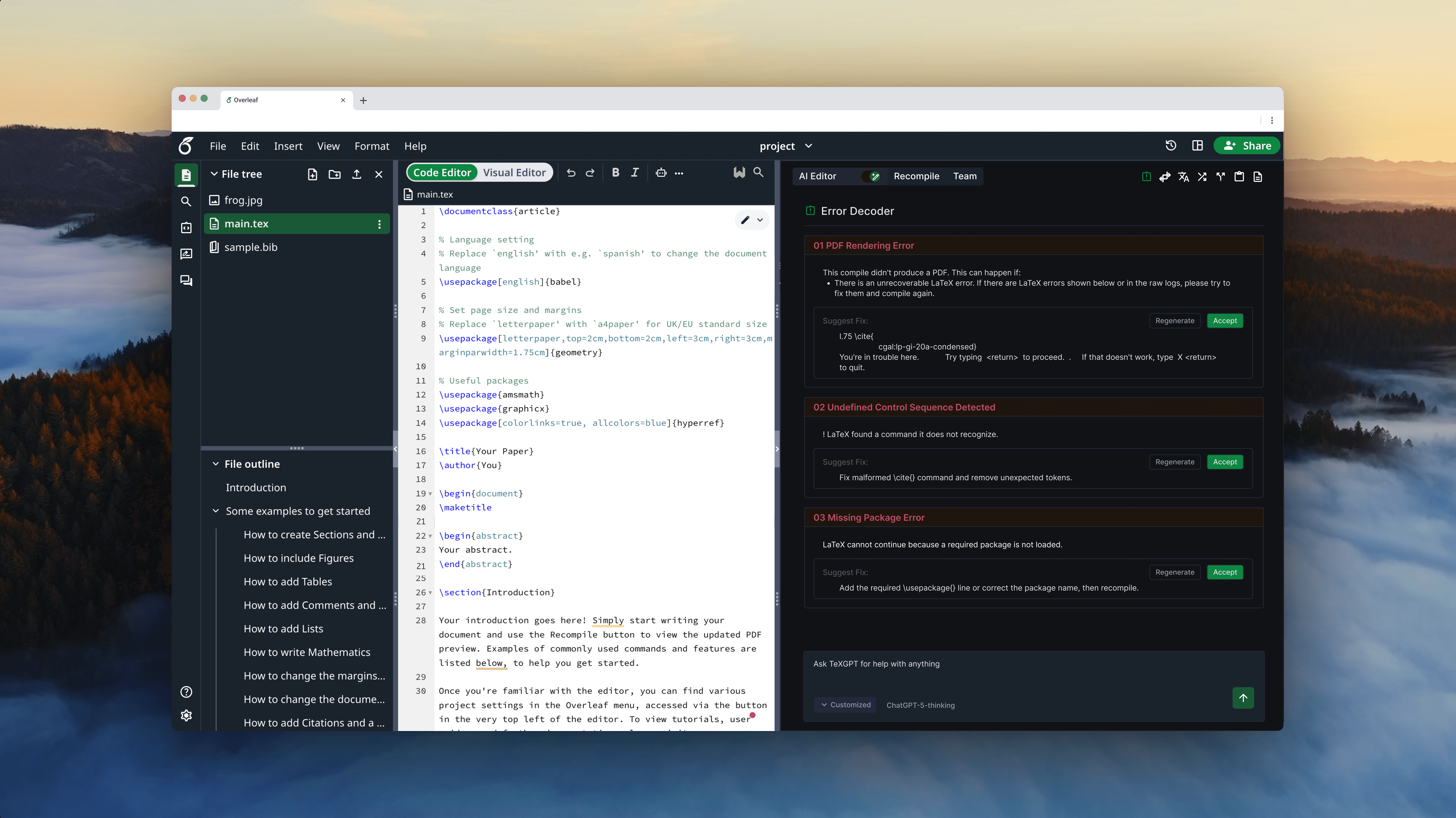
Get assistance from AI features in a larger panel, with a toggle to switch between two modes
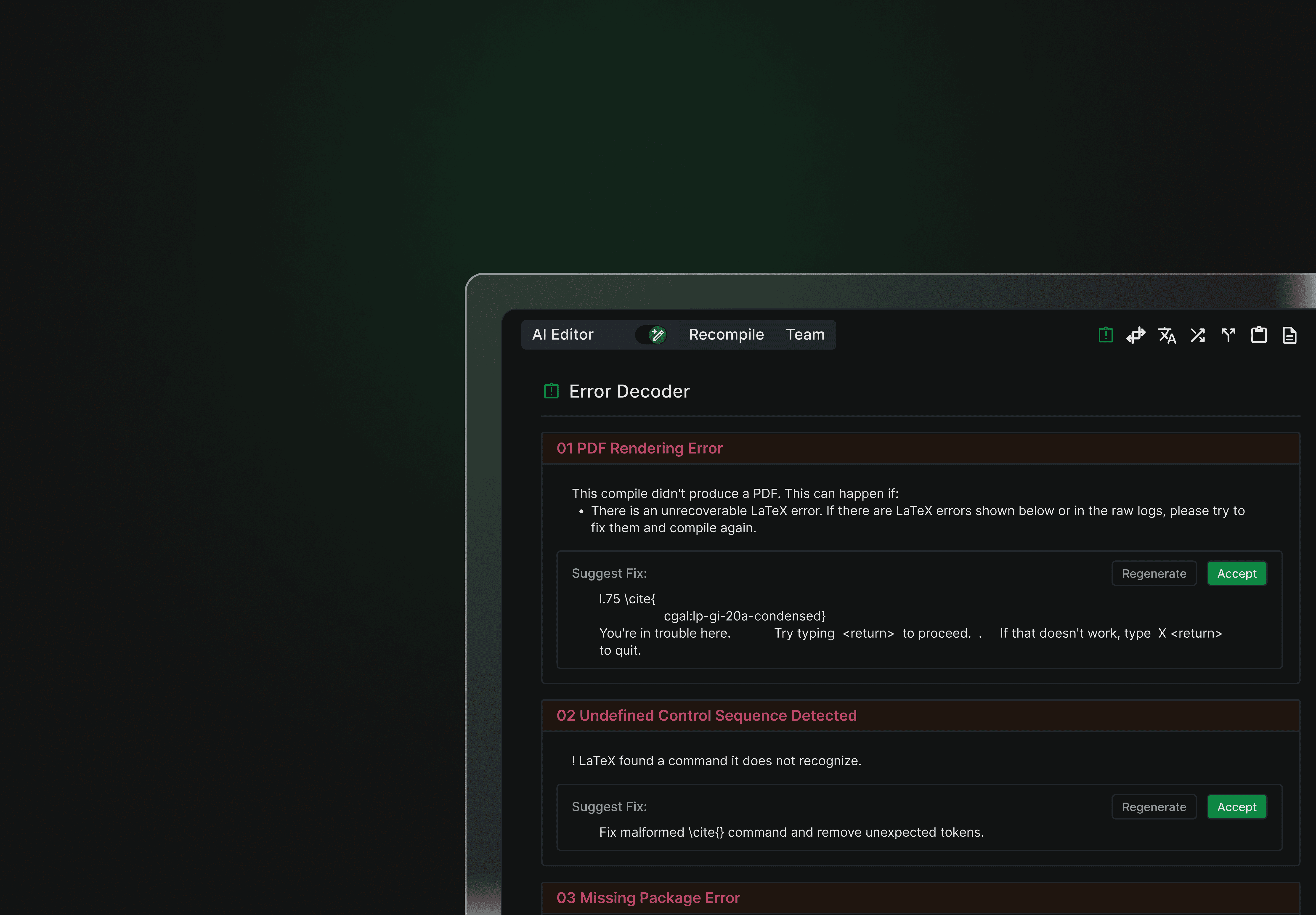
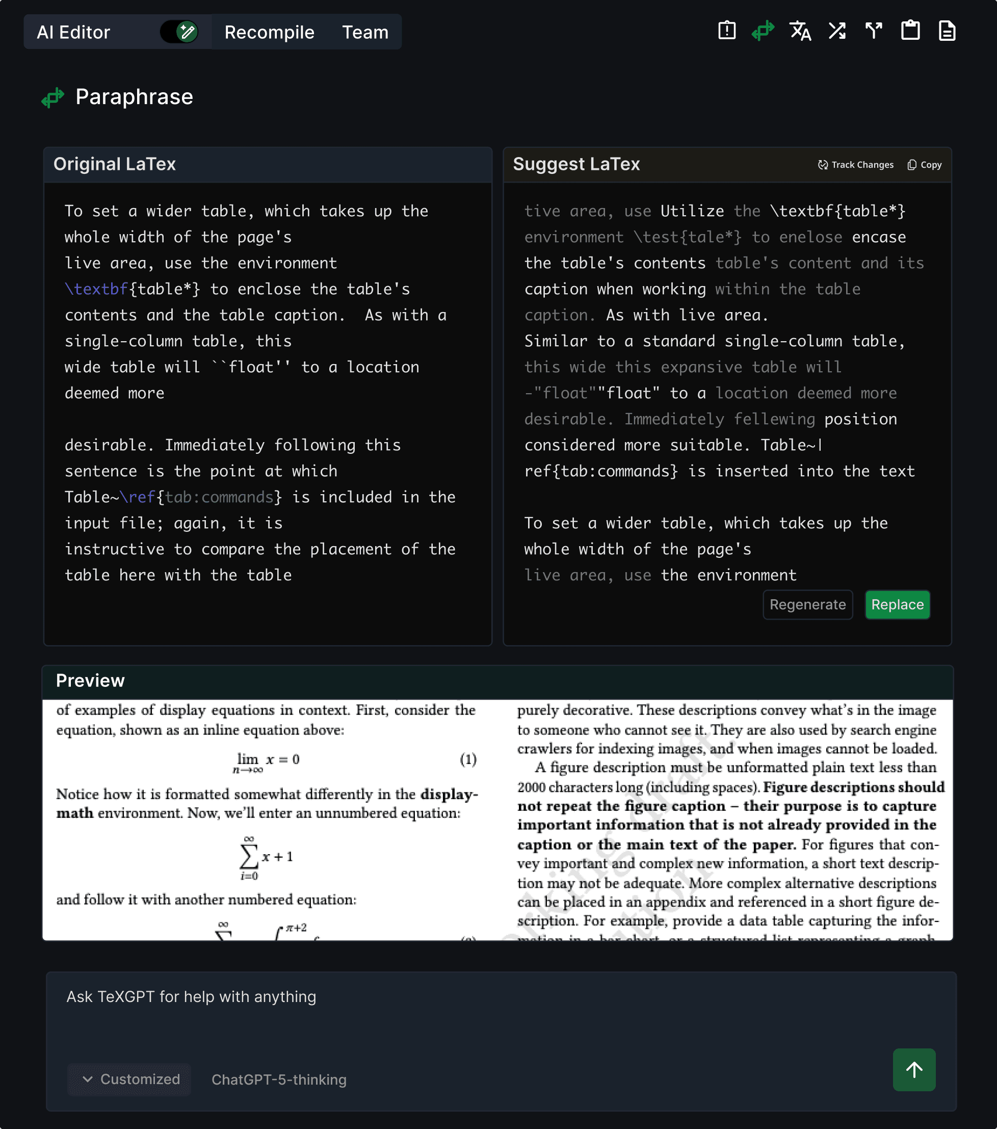
For the final deliverable, I separated generative and highlight-level AI into a larger panel, with each button placed in the top-right corner. Generative AI mode is set as the default, and the toggle allows users to switch to highlight-level AI mode.
AI Generator
AI Editor
Users can directly switch between two AI modes using toggle
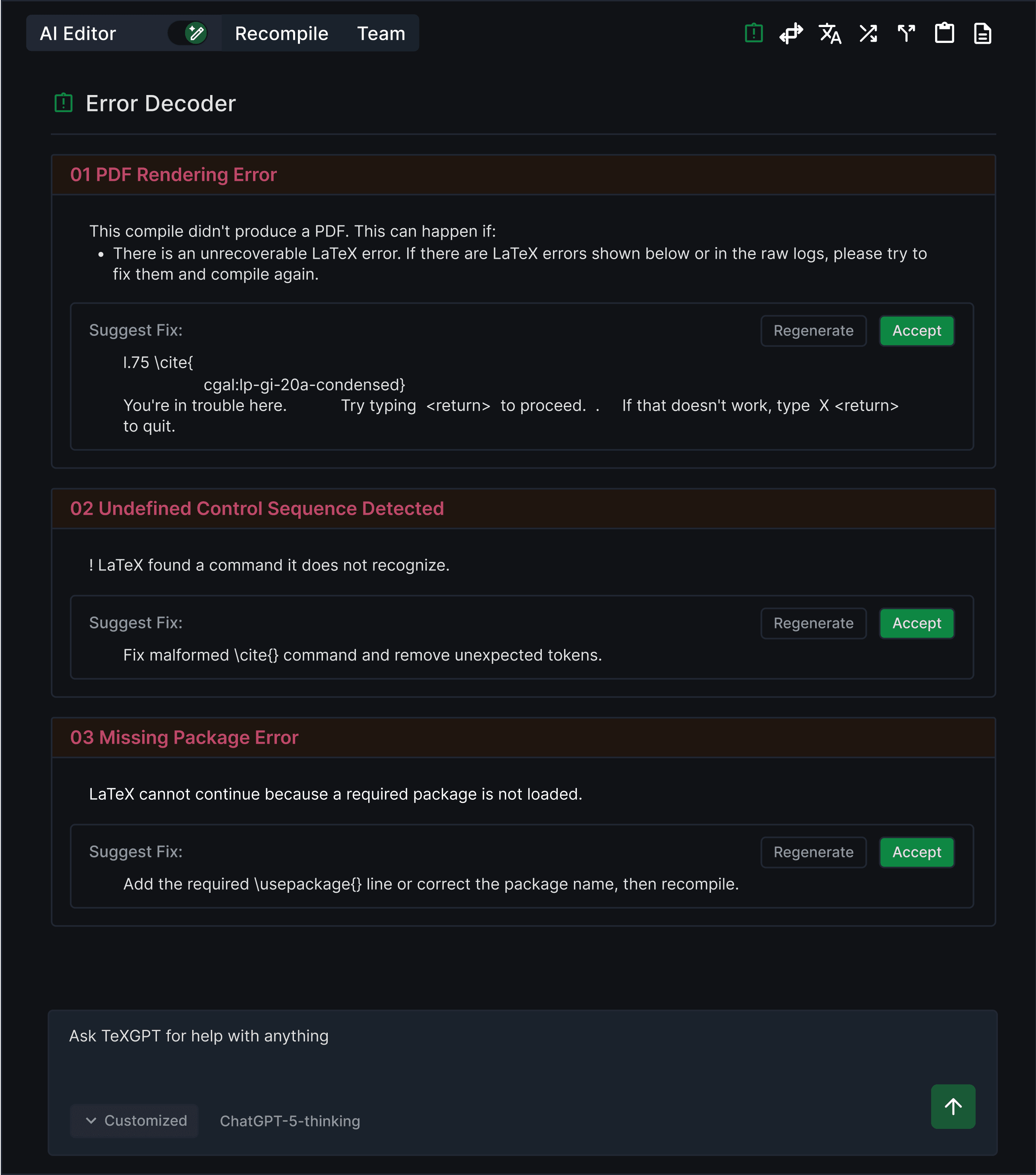
Highlight Level AI Panel
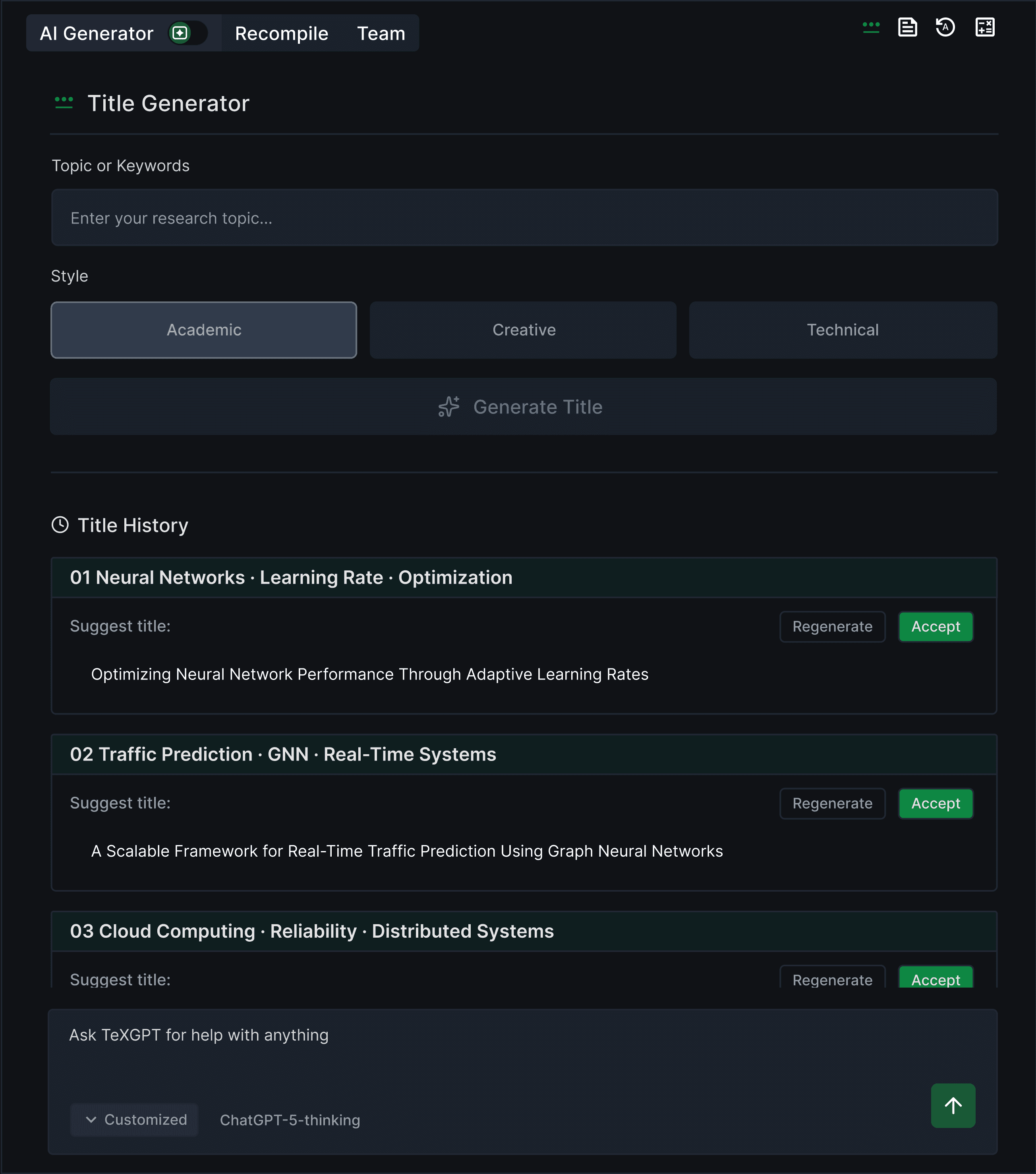
Generative Level AI Panel
On the right top of the panel, users can navigate diverse AI features
APPROACH 2 — CONSOLIDATED SCATTERED AI ENTRY POINTS
Use the Robot button as a unified entry point, allowing users to choose between Generative AI and Highlight AI in a single flow
Added a Keyboard Shortcut to Ensure Accessibility
I added keyboard shortcuts to the robot button’s submenu to improve accessibility for users navigating AI features with a keyboard.
Before
TexGPT
AI Generator
AI Editor
After
TexGPT
AI Generator
⌘ + Shift + G
AI Editor
⌘ + Shift + E
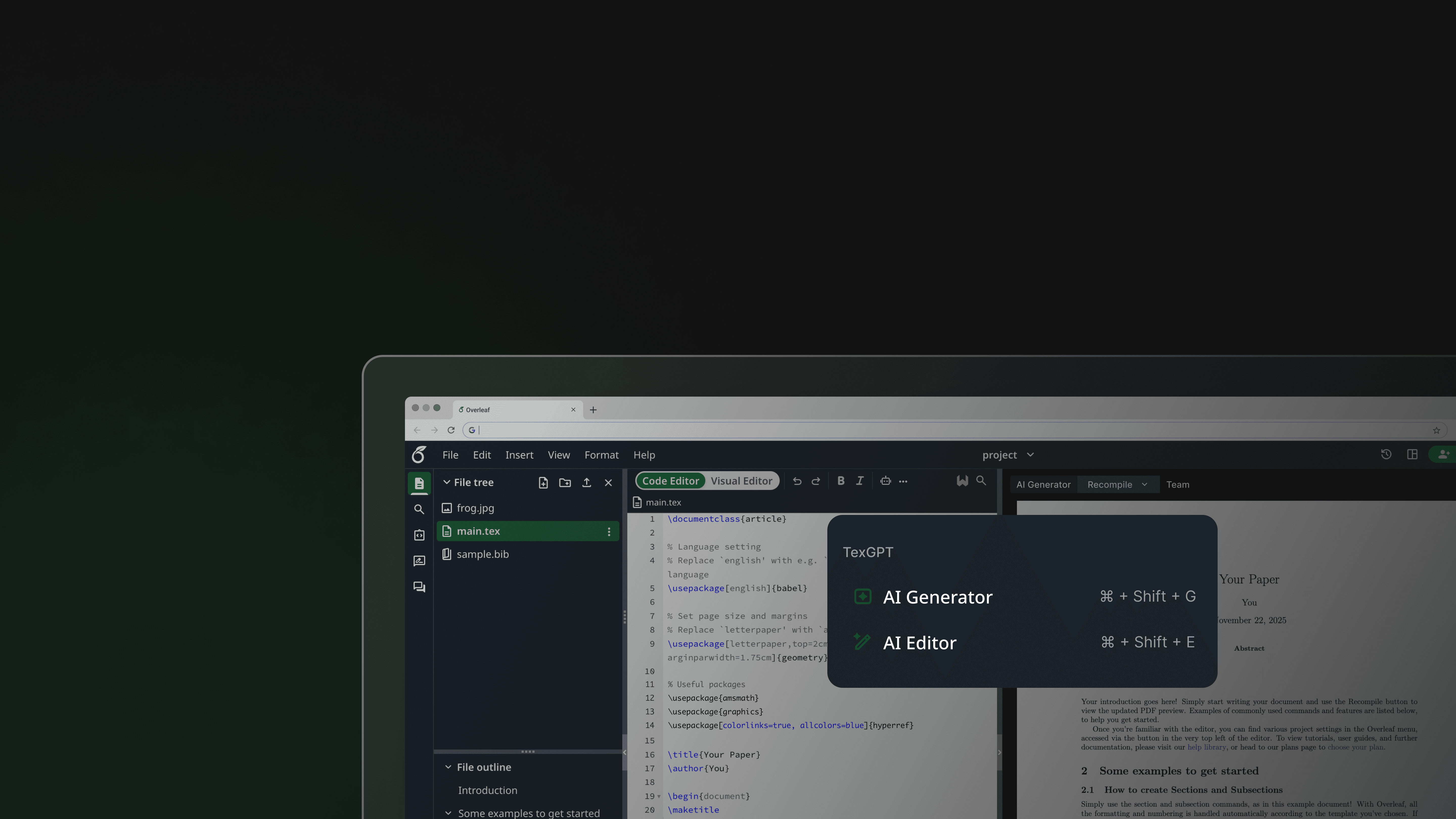
FINAL EXPERIENCE — CONSOLIDATED SCATTERED AI ENTRY POINTS
Access AI features through a centralized robot button
The robot button lets users choose between Generative AI and the AI Editor, reducing confusion caused by multiple features being mapped to a single button
FINAL DEMO
Bringing every element together into a unified flow
Usability Testing and Impact
Conducted virtual moderated usability testing with 5 participants including 3 task based scenario and post-task questionnaires.
USABILITY TESTING
Participant Demographic
3 Master’s students
2 Ph.D student
Tools
Zoom
Google Docs
Method
1
Virtual moderated
2
Task based with given scenario (4 tasks)
3
Post task questionnaire
Data were measured by likert-scale satisfaction ratings, task completion time, and qualitative observations through think a loud protocol.
Outcomes
3.7 → 4.6
Increase in user satisfaction
51.7%
Reduced time to locate AI features
(Compared to the original Overleaf)
If I had more time -
Next Steps
Current Design
If I had more time, I would work on improving the keyboard focus ring.
Currently, keyboard focus rings in Overleaf are limited to the left-side menu, restricting keyboard navigation in the top navigation bar. I will improve the accessibility by making focus states more glanceable and extending them consistently across the top navigation.
REFLECTION
Looking Back
Working on the Overleaf redesign pushed me to rethink how AI fits into code-based writing workflows. I realized that the main issues do not come from being overwhelmed by AI itself, but by fragmented entry points that increase cognitive load.
I learned about…
Accessibility
Team Communication
Design System Level Thinking
This project gave me an opportunity to consider accessibility throughout the design process. Since it is a web-based platform, there was a wide range of options, including keyboard shortcuts, a focus ring, and color contrast. If I had more time, I would add a focus ring throughout the design.
Since our team members were in different time zones, it wasn't easy to adjust each member's schedule. To address this, our team tried to respect each other's schedules and ensured to bring finalized tasks to the weekly meeting. I believe that respecting each other and taking responsibility led to the project's success.
I learned how to think above the visual design by considering the design system. Considering the design system not only results in a more consistent design but also reduces the communication gap with developers.
.thank you for reading
Overleaf Redesign: Consolidated Scattered AI Entry Points
Over summer of 2025, I had an opportunity to redesign Overleaf, a technical code editor, as part of Design For Passion 2025.
The redesigned Overleaf redefines the existing AI entry point by consolidating scattered AI buttons, making the AI features more glanceable and accessible by allowing users to discover more easily.
Timeframe
Jul 2025 - Sep 2025
Role
UI/UX Design
Tools
Figma
Team
2 UX Designer
1 UX Researcher
WHAT IS OVERLEAF?
Overleaf is a browser-based LaTeX (code) editor for academic and technical documents.
PROBLEM
Scattered AI entry points increased cognitive load and hindered discoverability, while the robot button’s visually cluttered interface failed to clearly distinguish between generative and highlight-level AI, leading to user confusion.
Scattered AI entry points make navigation difficult, revealing the opportunity to consolidate these features into a single space
Poor differentiation between generative and highlight-level AI, making it hard to tell which features are AI
The AI features in the robot button’s submenu are visually cluttered, making it difficult for users to distinguish them from other AI options
FEATURE BACKGROUND
AI features that generate new content, including title, abstract, keyword, and equation generators
AI feature for particular sentence, that users must highlight editor to access. Includes paraphrase, translate, change style, split / join, summarize, explain
Generate Level AI
AI feature can be grouped into two categories
Highlight Level AI
DESIGN QUESTION
How can we provide users with more glanceable and accessible access to AI features?
Define User Needs: Semi-Structured Interview
Research Insight
Users found AI entry points scattered and visually inconsistent, which made navigation confusing and the robot button’s submenu feel redundant.
Users struggled to understand how to use AI features due to fragmented entry points and unclear mode signaling.
USER INTERVIEW
DESIGN GOAL
Based on insights from user research, our design goal was to provide AI features that offer clear discoverability and mode transitions.
Direction 1 is about introducing a centralized AI panel to consolidate AI actions and switch between Generative and Highlight modes
Direction 2 is about using the Robot button as a unified entry point, allowing users to choose between two different AI modes within a single flow
APPROACH 1 — SWITCH BETWEEN TWO AI MODES
Introduced a centralized AI panel to consolidate AI actions and toggle between Generative and Highlight modes
ITERATIONS — SWITCH BETWEEN TWO AI MODES
Before finalizing the design, I refined the color usage and components to improve visual consistency and reduce eye strain, making the panel more intuitive to use.
Improved Mode Scanability by Replacing the Switch with a Toggle
I replaced the switch button with a toggle to give users a more immediate sense of switching between the two AI modes.
Before
After
Built a Custom Toggle for Switching Between Generative and Highlight-Level AI
I designed a toggle for generative and highlight-level AI, using mode-specific icons to improve glanceability and quick recognition.
Before
After
Reduced Visual Fatigue Through Color Contrast Refinement
I refined the UI to reduce eye strain for users, as Overleaf is typically used for long, extended work sessions. To improve visual comfort, I reduced the contrast between the background and text by adjusting the background color from #000000 to #101216 and updating the text color to #E3E3E3.
Before
After
FINAL EXPERIENCE — SWITCH BETWEEN TWO AI MODES
Get assistance from AI features in a larger panel, with a toggle to switch between two modes
For the final deliverable, I separated generative and highlight-level AI into a larger panel, with each button placed in the top-right corner. Generative AI mode is set as the default, and the toggle allows users to switch to highlight-level AI mode.
Users can directly switch between two AI modes using toggle
Highlight Level AI Panel
Generative Level AI Panel
On the right top of the panel, users can navigate diverse AI features
APPROACH 2 — CONSOLIDATED SCATTERED AI ENTRY POINTS
Use the Robot button as a unified entry point, allowing users to choose between Generative AI and Highlight AI in a single flow
Added a Keyboard Shortcut to Ensure Accessibility
I added keyboard shortcuts to the robot button’s submenu to improve accessibility for users navigating AI features with a keyboard.
Before
TexGPT
AI Generator
AI Editor
After
TexGPT
AI Generator
⌘ + Shift + G
AI Editor
⌘ + Shift + E
FINAL EXPERIENCE — CONSOLIDATED SCATTERED AI ENTRY POINTS
Access AI features through a centralized robot button
The robot button lets users choose between Generative AI and the AI Editor, reducing confusion caused by multiple features being mapped to a single button
FINAL DEMO
Bringing every element together into a unified flow
Usability Testing and Impact
Conducted virtual moderated usability testing with 5 participants including 3 task based scenario and post-task questionnaires.
USABILITY TESTING
Participant Demographic
3 Master’s students
2 Ph.D student
Tools
Zoom
Google Docs
Method
1
Virtual moderated
2
Task based with given scenario (4 tasks)
3
Post task questionnaire
Data were measured by likert-scale satisfaction ratings, task completion time, and qualitative observations through think a loud protocol.
Outcomes
3.7 → 4.6
Increase in user satisfaction
51.7%
Reduced time to locate AI features
(Compared to the original Overleaf)
If I had more time -
Next Steps
Current Design
If I had more time, I would work on improving the keyboard focus ring.
Currently, keyboard focus rings in Overleaf are limited to the left-side menu, restricting keyboard navigation in the top navigation bar. I will improve the accessibility by making focus states more glanceable and extending them consistently across the top navigation.
REFLECTION
Looking Back
Working on the Overleaf redesign pushed me to rethink how AI fits into code-based writing workflows. I realized that the main issues do not come from being overwhelmed by AI itself, but by fragmented entry points that increase cognitive load.
I learned about…
Accessibility
Team Communication
Design System Level Thinking
This project gave me an opportunity to consider accessibility throughout the design process. Since it is a web-based platform, there was a wide range of options, including keyboard shortcuts, a focus ring, and color contrast. If I had more time, I would add a focus ring throughout the design.
Since our team members were in different time zones, it wasn't easy to adjust each member's schedule. To address this, our team tried to respect each other's schedules and ensured to bring finalized tasks to the weekly meeting. I believe that respecting each other and taking responsibility led to the project's success.
I learned how to think above the visual design by considering the design system. Considering the design system not only results in a more consistent design but also reduces the communication gap with developers.
.thank you for reading
Overleaf Redesign: Consolidated Scattered AI Entry Points
Over summer of 2025, I had an opportunity to redesign Overleaf, a technical code editor, as part of Design For Passion 2025.
The redesigned Overleaf redefines the existing AI entry point by consolidating scattered AI buttons, making the AI features more glanceable and accessible by allowing users to discover more easily.
Timeframe
Jul 2025 - Sep 2025
Role
UI/UX Design
UX Research
Tools
Figma
Team
2 UX Designer
1 UX Researcher
WHAT IS OVERLEAF?
Overleaf is a browser-based LaTeX (code) editor for academic and technical documents.
PROBLEM
Scattered AI entry points increased cognitive load and hindered discoverability, while the robot button’s visually cluttered interface failed to clearly distinguish between generative and highlight-level AI, leading to user confusion.
Scattered AI entry points make navigation difficult, revealing the opportunity to consolidate these features into a single space
Poor differentiation between generative and highlight-level AI, making it hard to tell which features are AI
The AI features in the robot button’s submenu are visually cluttered, making it difficult for users to distinguish them from other AI options
FEATURE BACKGROUND
AI features that generate new content, including title, abstract, keyword, and equation generators
AI feature for particular sentence, that users must highlight editor to access. Includes paraphrase, translate, change style, split / join, summarize, explain
Generate Level AI
AI feature can be grouped into two categories
Highlight Level AI
DESIGN QUESTION
How can we provide users with more glanceable and accessible access to AI features?
Define User Needs:
Semi-Structured Interview
Research Insight
Users found AI entry points scattered and visually inconsistent, which made navigation confusing and the robot button’s submenu feel redundant.
Users struggled to understand how to use AI features due to fragmented entry points and unclear mode signaling.
USER INTERVIEW
DESIGN GOAL
Based on insights from user research, our design goal was to provide AI features that offer clear discoverability and mode transitions.
Direction 1 is about introducing a centralized AI panel to consolidate AI actions and switch between Generative and Highlight modes
Direction 2 is about using the Robot button as a unified entry point, allowing users to choose between two different AI modes within a single flow
APPROACH 1 — SWITCH BETWEEN TWO AI MODES
Introduced a centralized AI panel to consolidate AI actions and toggle between Generative and Highlight modes
ITERATIONS — SWITCH BETWEEN TWO AI MODES
Before finalizing the design, I refined the color usage and components to improve visual consistency and reduce eye strain, making the panel more intuitive to use.
Improved Mode Scanability by Replacing the Switch with a Toggle
I replaced the switch button with a toggle to give users a more immediate sense of switching between the two AI modes.
Before
After
Built a Custom Toggle for Switching Between Generative and Highlight-Level AI
I designed a toggle for generative and highlight-level AI, using mode-specific icons to improve glanceability and quick recognition.
Before
After
Reduced Visual Fatigue Through Color Contrast Refinement
I refined the UI to reduce eye strain for users, as Overleaf is typically used for long, extended work sessions. To improve visual comfort, I reduced the contrast between the background and text by adjusting the background color from #000000 to #101216 and updating the text color to #E3E3E3.
Before
After
FINAL EXPERIENCE — SWITCH BETWEEN TWO AI MODES
Get assistance from AI features in a larger panel, with a toggle to switch between two modes
For the final deliverable, I separated generative and highlight-level AI into a larger panel, with each button placed in the top-right corner. Generative AI mode is set as the default, and the toggle allows users to switch to highlight-level AI mode.
Users can directly switch between two AI modes using toggle
Highlight Level AI Panel
Generative Level AI Panel
On the right top of the panel, users can navigate diverse AI features
APPROACH 2 — CONSOLIDATED SCATTERED AI ENTRY POINTS
Use the Robot button as a unified entry point, allowing users to choose between Generative AI and Highlight AI in a single flow
Added a Keyboard Shortcut to Ensure Accessibility
I added keyboard shortcuts to the robot button’s submenu to improve accessibility for users navigating AI features with a keyboard.
Before
TexGPT
AI Generator
AI Editor
After
TexGPT
AI Generator
⌘ + Shift + G
AI Editor
⌘ + Shift + E
FINAL EXPERIENCE — CONSOLIDATED SCATTERED AI ENTRY POINTS
Access AI features through a centralized robot button
The robot button lets users choose between Generative AI and the AI Editor, reducing confusion caused by multiple features being mapped to a single button
FINAL DEMO
Bringing every element together into a unified flow
Usability Testing and Impact
Conducted virtual moderated usability testing with 5 participants including 3 task based scenario and post-task questionnaires.
USABILITY TESTING
Participant Demographic
3 Master’s students
2 Ph.D student
Tools
Zoom
Google Docs
Method
1
Virtual moderated
2
Task based with given scenario (4 tasks)
3
Post task questionnaire
Data were measured by likert-scale satisfaction ratings, task completion time, and qualitative observations through think a loud protocol.
Outcomes
3.7 → 4.6
Increase in user satisfaction
51.7%
Reduced time to locate AI features
(Compared to the original Overleaf)
If I had more time -
Next Steps
Current Design
If I had more time, I would work on improving the keyboard focus ring.
Currently, keyboard focus rings in Overleaf are limited to the left-side menu, restricting keyboard navigation in the top navigation bar. I will improve the accessibility by making focus states more glanceable and extending them consistently across the top navigation.
REFLECTION
Looking Back
Working on the Overleaf redesign pushed me to rethink how AI fits into code-based writing workflows. I realized that the main issues do not come from being overwhelmed by AI itself, but by fragmented entry points that increase cognitive load.
I learned about…
Accessibility
Team Communication
Design System Level Thinking
This project gave me an opportunity to consider accessibility throughout the design process. Since it is a web-based platform, there was a wide range of options, including keyboard shortcuts, a focus ring, and color contrast. If I had more time, I would add a focus ring throughout the design.
Since our team members were in different time zones, it wasn't easy to adjust each member's schedule. To address this, our team tried to respect each other's schedules and ensured to bring finalized tasks to the weekly meeting. I believe that respecting each other and taking responsibility led to the project's success.
I learned how to think above the visual design by considering the design system. Considering the design system not only results in a more consistent design but also reduces the communication gap with developers.
.thank you for reading
Overleaf Redesign: Consolidated Scattered AI Entry Points
Timeframe
Jul 2025 - Sep 2025
Role
UI/UX Design
Tools
Figma
Team
2 UX Designer
1 UX Researcher
Over summer of 2025, I had an opportunity to redesign Overleaf, a technical code editor, as part of Design For Passion 2025.
The redesigned Overleaf redefines the existing AI entry point by consolidating scattered AI buttons, making the AI features more glanceable and accessible by allowing users to discover more easily.
WHAT IS OVERLEAF?
Overleaf is a browser-based LaTeX (code) editor for academic and technical documents.
It’s similar to Google Docs, but instead of directly editing text, users make changes by writing code.
PROBLEM
Scattered AI entry points increased cognitive load and hindered discoverability, while the robot button’s visually cluttered interface failed to clearly distinguish between generative and highlight-level AI, leading to user confusion.
Scattered AI entry points make navigation difficult, revealing the opportunity to consolidate these features into a single space
Poor differentiation between generative and highlight-level AI, making it hard to tell which features are AI
The AI features in the robot button’s submenu are visually cluttered, making it difficult for users to distinguish them from other AI options
FEATURE BACKGROUND
AI features that generate new content, including title, abstract, keyword, and equation generators
AI feature for particular sentence, that users must highlight editor to access. Includes paraphrase, translate, change style, split / join, summarize, explain
Generate Level AI
AI feature can be grouped into two categories
Highlight Level AI
DESIGN QUESTION
How can we provide users with more glanceable and accessible access to AI features?
Define User Needs:
Semi-Structured Interview
Research Insight
Users found AI entry points scattered and visually inconsistent, which made navigation confusing and the robot button’s submenu feel redundant.
Users struggled to understand how to use AI features due to fragmented entry points and unclear mode signaling.
USER INTERVIEW
DESIGN GOAL
Based on insights from user research, our design goal was to provide AI features that offer clear discoverability and mode transitions.
Direction 1 is about introducing a centralized AI panel to consolidate AI actions and switch between Generative and Highlight modes
Direction 2 is about using the Robot button as a unified entry point, allowing users to choose between two different AI modes within a single flow
APPROACH 1 — SWITCH BETWEEN TWO AI MODES
Introduced a centralized AI panel to consolidate AI actions and toggle between Generative and Highlight modes
ITERATIONS — SWITCH BETWEEN TWO AI MODES
Before finalizing the design, I refined the color usage and components to improve visual consistency and reduce eye strain, making the panel more intuitive to use.
Improved Mode Scanability by Replacing the Switch with a Toggle
I replaced the switch button with a toggle to give users a more immediate sense of switching between the two AI modes.
Before
After
Built a Custom Toggle for Switching Between Generative and Highlight-Level AI
I designed a toggle for generative and highlight-level AI, using mode-specific icons to improve glanceability and quick recognition.
Before
After
Reduced Visual Fatigue Through Color Contrast Refinement
I refined the UI to reduce eye strain for users, as Overleaf is typically used for long, extended work sessions. To improve visual comfort, I reduced the contrast between the background and text by adjusting the background color from #000000 to #101216 and updating the text color to #E3E3E3.
Before
After
FINAL EXPERIENCE — SWITCH BETWEEN TWO AI MODES
Get assistance from AI features in a larger panel, with a toggle to switch between two modes
For the final deliverable, I separated generative and highlight-level AI into a larger panel, with each button placed in the top-right corner. Generative AI mode is set as the default, and the toggle allows users to switch to highlight-level AI mode.
Users can directly switch between two AI modes using toggle
Highlight Level AI Panel
Generative Level AI Panel
On the right top of the panel, users can navigate diverse AI features
APPROACH 2 — CONSOLIDATED SCATTERED AI ENTRY POINTS
Use the Robot button as a unified entry point, allowing users to choose between Generative AI and Highlight AI in a single flow
Added a Keyboard Shortcut to Ensure Accessibility
I added keyboard shortcuts to the robot button’s submenu to improve accessibility for users navigating AI features with a keyboard.
Before
TexGPT
AI Generator
AI Editor
After
TexGPT
AI Generator
⌘ + Shift + G
AI Editor
⌘ + Shift + E
FINAL EXPERIENCE — CONSOLIDATED SCATTERED AI ENTRY POINTS
Access AI features through a centralized robot button
The robot button lets users choose between Generative AI and the AI Editor, reducing confusion caused by multiple features being mapped to a single button
FINAL DEMO
Bringing every element together into a unified flow
Usability Testing and Impact
Conducted virtual moderated usability testing with 5 participants including 3 task based scenario and post-task questionnaires.
USABILITY TESTING
Participant Demographic
3 Master’s students
2 Ph.D student
Tools
Zoom
Google Docs
Method
1
Virtual moderated
2
Task based with given scenario (4 tasks)
3
Post task questionnaire
Data were measured by likert-scale satisfaction ratings, task completion time, and qualitative observations through think a loud protocol.
Outcomes
3.7 → 4.6
Increase in user satisfaction
51.7%
Reduced time to locate AI features
(Compared to the original Overleaf)
If I had more time -
Next Steps
Current Design
If I had more time, I would work on improving the keyboard focus ring.
Currently, keyboard focus rings in Overleaf are limited to the left-side menu, restricting keyboard navigation in the top navigation bar. I will improve the accessibility by making focus states more glanceable and extending them consistently across the top navigation.
REFLECTION
Looking Back
Working on the Overleaf redesign pushed me to rethink how AI fits into code-based writing workflows. I realized that the main issues do not come from being overwhelmed by AI itself, but by fragmented entry points that increase cognitive load.
I learned about…
Accessibility
Team Communication
Design System Level Thinking
This project gave me an opportunity to consider accessibility throughout the design process. Since it is a web-based platform, there was a wide range of options, including keyboard shortcuts, a focus ring, and color contrast. If I had more time, I would add a focus ring throughout the design.
Since our team members were in different time zones, it wasn't easy to adjust each member's schedule. To address this, our team tried to respect each other's schedules and ensured to bring finalized tasks to the weekly meeting. I believe that respecting each other and taking responsibility led to the project's success.
I learned how to think above the visual design by considering the design system. Considering the design system not only results in a more consistent design but also reduces the communication gap with developers.
.thank you for reading

